New Coca-Cola branding unifies consumers in confusion
Coca-Cola’s new unified branding campaign launched in Spain has a side effect: damaging product recognition.
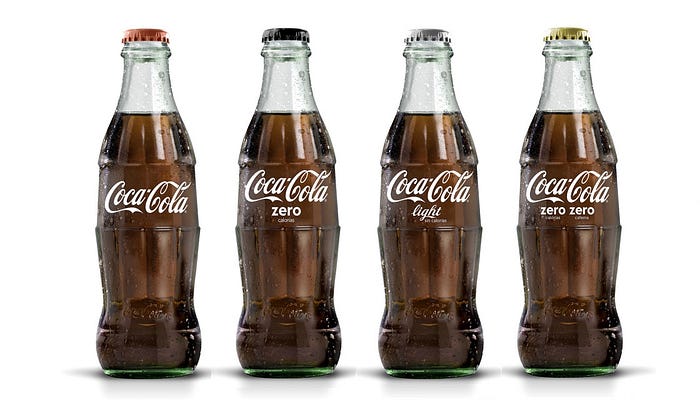
Today I met my brother for lunch at a restaurant at Madrid. We both ordered coke with our meals. I chose regular while Joe had a diet (light in Spain). When the waitress served our drinks (in those wonderful, large retro inspired bottles) she brought us the wrong type of cokes (zero). After his first sip, my brother realized and told the waitress. It took the three of us a while to determine the actual type of Coca-Cola in each bottle. Have a look at the new Coca-Cola bottles:

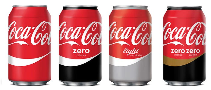
The brand elements in the picture above seem to have been computer enhanced. However in the real-life, if you combine the slightly dampen bottles with the dimmed light environment of many restaurants, the distinctive features are much harder to spot. The waitress confessed that these new bottles were a nightmare to her, specially on rush hours. Interestingly enough she mentioned that Coca-Cola’s new branding was challenging even in the supermarket. The reason is new can design. Have a look at this picture from Coca Cola’s website.

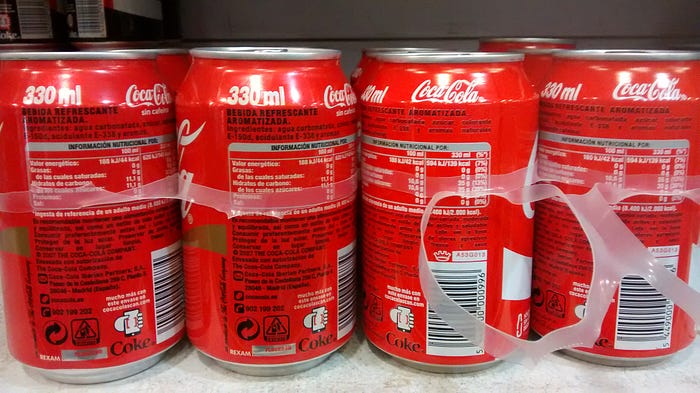
Again the brand elements in the picture above appear to have been enhanced. Below the same cans as actually seen in a supermarket. The cans to the left are decaf and those to the right regular coke.

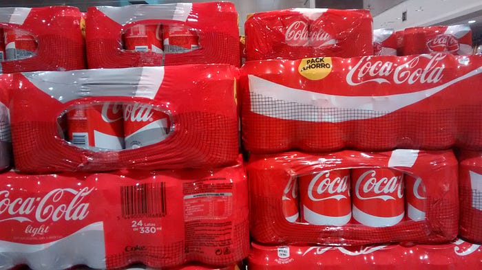
Admittedly, this was the worst scenario I found. But things didn’t get much better with bundle packaging. Here’s a shot I made a couple of days ago at the soft drink aisle of another supermarket. These are 24-can packs. Left, diet. To the right, regular.

Unsurprisingly it took a while for people to decide which can pack to load on their trolleys. It seems Coca-Cola branding efforts have penalized customer shopping experience, turning an everyday routine action into a more demanding task.
Sure Coca Cola had powerful reasons for all this rebranding effort. And obviously they’ve put a few bucks to push it through the media and reach customers. However for me it was apparent from the start that the new design would difficult product identification. And while I’m a user experience guy, I’m sure I’m not the only one that realized the new design had a big potential for confusing the customer.
So the question is how is it possible a customer centric company such as Coca-Cola didn’t spot this before launching this whole campaign. Or maybe they did, but decided to take the hit for the sake of its branding strategy. If that’s the case, I would like to know how is this paying off.
